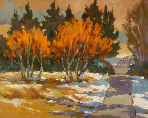
"Winter Willows", 8x10 oil on board
I have a shelf in my studio that I put my plein air work up to dry on, and this gives me a chance to live with them as well. I posted about a painting I did en plein air recently, something about it really was bothering me. For me, if a painting goes sideways then it is likely to be a shape problem or a colour one. So I decided to experiment with this one -after all if it isn't working, what do I have to lose but the opportunity to learn more about the craft of painting. The first thing was to determine what it was about it that was really bothering me. I found the shapes of the two trees to be too similar and too bush-like. Also the colour harmonies weren't working for me. Compare to the original painting below:

I didn't think the violet of the snow shadows worked with the orange of the willow trees, so I changed it to a neutralized complement of blue-green. I also changed the shapes of the trees to make them look less like bushes. I decided that the warm/cool balance needed so help so I made the trees at the right hand edge warmer and warmed up the road some. I decreased the warmth in the fir trees and changed the colour in the sky to a more peach colour to lessen the somewhat strident impact of the orange willows. Not sure if the painting is any better, as in doing the changes, I also lost a lot of the freshness of the original painting. However, for me painting is not as much about product as it is about process and learning to be a better painter. I learnt a lot from this little lesson. It is amazing how much a little change in one area throws the rest of the painting into disorder, tweaking one thing results in having to tweek several other unrelated things. Hopefully in the end, I will be a more aware, better and more creative painter while painting plein air. It needs to get into the unconscious as goodness knows one does not have time to consciously think about these things in the heat (or cold) of the moment!
By the way, a large difference in the two images you see is due to photography! I find it VERY difficult to take good photos in the winter, and while I played in photoshop to get it right, there is only so much one can do.The painting is actually much brighter than it shows in the first image. Maybe I should just bit the bullet and purchase a photo cube...
Let me know what you think of the changes made -what would you have done differently!
Enjoy!
To purchase this painting, or commission your own painting, please
email me.
Share |


I agree, Sharon, I think the revised version is a better painting. The shadows are more subtle and, I think, work much better with the overall painting. It is richer and more subtle. I also like the second version of the trees. I think the revised version is a much more interesting painting. Good job!
ReplyDeleteThanks so much Virginia! You are a gal after my own heart :)
ReplyDelete