Showing posts with label colour. Show all posts

Wednesday

How to create a harmonious painting with a limited palette.


I am really enjoying creating videos to help artists with fundamentals of painting, and I seem to be getting good feedback, so I am going to continue here. In this video, I will show you how to make a harmonious painting from a limited palette, from a reference that you love! I chose this lovely abstract "Black Tangerine", oil on canvas, 2014, by Rose Marie Kossowan.


Share |

Sunday

Back in the saddle!


Hello friends, I realize I haven't been here for 3 years -wow that went by really fast! I have decided that in this time of Covid sheltering at home, I would like to connect with you all again. I hope that you and all those you love are well, and are finding your way through this strange time. My hubby Dave and I have been healthy, physically and mostly emotionally, although I personally feel like I am on a bit of a roller coaster, tossing between sorrow for those less fortunate than I am (think single mothers with little kids, women in abusive relationships, etc, etc...) and elation at how beautiful the weather is becoming and that I am SO grateful to be alive and have all of my needs met, and then feeling a bit guilty for that, rinse and repeat!

So I decided that perhaps I can bring a little colour and joy into your inbox. That was my answer to the question "What do you have in your hand that could help others?" So I hope you will receive it in the spirit that it is being sent!

I am not going to try to fill in what has taken place over the last 3 years artistically, but I will share my recent work. Over the last 2 years I have been on a search to find a more contemporary expression for the landscapes that I love painting so much, searching for a unique and authentic voice that I loved and also captured the hearts of people. So below is some of that new work.
This painting is a sort of summary of my new work.  "The Red Makes It", now in its forever home, captures my new approach to the landscape. Over the past 7 years of painting in oils 'en plein air' (outside in front of the scene) I have grasped an appreciation of how the sun illuminates all the objects it falls on, giving each part its own individual identity, as if each one has a solo part in a choir full of beauty. Words fail me, that is not my gift. So I take my brush and paint how I feel about the things I see. My adjectives are radiant, intense colours, my nouns the form that are devised to play and dance with the other shapes on the canvas. This is not the world you might see with your eyes, but hopefully it expresses what you might feel if you were standing in my painting.

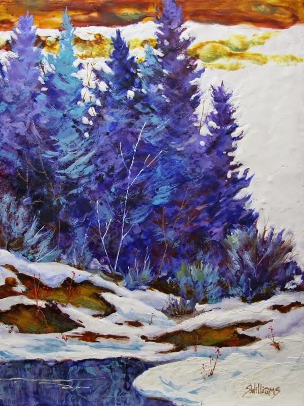
I did "Embrace Of Nature" purely from my imagination this winter. I began with a ton of colour and texture, having the idea of wanting to paint a forest, and eager to see what would reveal itself. The yellow and blue bands felt like arms to me and as I 'painted away the parts that weren't trees',  I began to see the importance of Nature, enfolding everything in its arms, giving order to the seemingly wild and untamed.

And this last piece, "Rundle's Song" was an attempt to put my new philosophy into practice with landscapes that I have painted many times in somewhat more representational, 'realistic' ways. I think it expresses the joy I feel standing at the side of Vermillion Lakes, gazing up at the power that is Mt Rundle.

I hope that you enjoy these images -please let me know if you do!

Blessings
Sharon
(You can see more of my new work on my website at http://sharonlynnwilliams.com)


Share |

Sedona Paintings by Sharon Lynn Williams


"Cathedral Rock -Sedona", 7x12" plein air oil on board
$195 unframed

I see that I forgot to post some plein air paintings that I did in Sedona at this time last year. I am revisiting them because these paintings will be available at the Leighton Art Centre Annual Clothesline Sale coming up this June 6 & 7.


This is a great opportunity to get some wonderful unframed artwork by many different artists in many different styles, and at great prices to boot.

 "Cathedral Rock From Crescent Moon Park", 9x12" plein air oil
$225 unframed

"Chapel Rock, Sedona", 12x16" plein air oil on board
$250 unframed

Plein air painting in the gorgeous red rocks of Sedona presented this Alberta girl with some unique challenges, as we have nothing like this anywhere near here. The red rock has glowing vibrant shadows, which all contrast nicely with the green and grey green foliage surrounding them. and the brilliant blue of the sky -such a riot of colour really makes my heart sing.

I chose to portray the shadows with a transparent violet in the last two paintings, and I think it really conveyed the cool yet still warm shadows well.  There was a real challenge in painting these intricate mountains as the shadow shapes kept changing. The only thing to do is to block in the shapes as they are at the beginning of the painting and then stick to them for the duration. Chasing the sun is never a good idea in plein air painting.

Enjoy!


Share |

Monday

"Creekside Winter" encaustic painting by Sharon Lynn Williams


"Winter Colour", 10x14" encaustic on cradled panel
$450.00 framed 

I have been on a real roll with my encaustic painting. I have been working from old paintings, and this one came from a really old watercolour that I loved -so glad that over the years I have always taken the time to document all of my work! I made a large version of this painting because I was so pleased with how the smaller one turned out, and it is posted below. 


"Creekside Winter", 18x24" encaustic on cradled panel, sides stained
$1050.00

I am happy to announce that this painting was one of 5 accepted into the next Federation of Canadian Artists' show coming up (please see invitation below)


Hope to see you there!

Share |

Wednesday

"More Colours of Winter" encaustic painting by Sharon Lynn Williams


"More Colours Of Winter", 24x24" encaustic on cradled panel
SOLD

I have not been very good at keeping my blog up to date this year, and I am trying to rectify that situation. I have been trying to balance not sending you too much email (for those who have generously subscribed to my blog) with keeping you up to date on what I have been up to in my art career. I have just cancelled my membership in the two online art galleries that I have been in for the past 3 years, as they just weren't worth the expense -it seems that there are way too many folks out there who want to pay so little for original works of art, and I just can't and don't wish to compete. I work hard in my career, and it deserves to be compensated -if I don't respect my own value, then how can I expect others to?

I have been spending time almost daily in my studio working in encaustic -inside winter work -it is a fascinating medium. Basically I make my own paint (beeswax, damar resin for hardening and powder pigments). The paint is then kept molten on a griddle at about 200 degrees. You apply the paint with natural hair brushes, and the paint cools and hardens as soon as the heat source is removed. Each layer of wax must be fused with the previous ones (I use a heat gun or butane torch) so that the layers will not delaminate -here is where the tricky part lies -if you heat too much the bottom layers become molten and rise up through the new layers (an effect which leaves very cool effect, but control is totally lacking). I love the way the molten wax flows, a lot like watercolour, my first love. The advantage is that you can can continue to work on a piece because the layers cool so quickly, there is no drying time involved, unlike oils. The colours are incredibly vibrant and the luminosity of all those layers is something that is totally unique to the medium. Many people work in abstract fashion in encaustics, I believe because of the limitations of control -also many come to encaustics without a full understanding of art -anyone can do it, but not everyone can make 'art' with it! I have been spending hours and hours learning the ins and outs of the medium, seeing what I can do with what I already know about creating a painting. It is tremendously exciting now that I am getting the results I want to achieve. My goal is to use the medium to create paintings that bridge all of my other interests -my plein air oil landscapes, watercolour 'puddling of colour' effects and my work in collage (encaustic is a wonderful medium for collage as the wax acts like a glue). I have also begun to work larger, which brings its own challenges.

Todays post is based on a watercolour painting that I did a number of years ago that I just loved. At this point, I am recreating some of my most favorite paintings done in other mediums. It is enough for now to concentrate on the medium rather than adding all the other challenges involved in making a good composition with solid colour harmony! Here is the original watercolour FYI:

"The Colours Of Winter", 19x19" watercolour, SOLD

So the artistic journey continues -please stay tuned for more!!
Share |

Sunday

"January's Colours", encaustic by Sharon Lynn Williams


"January's Colours", 12 x 12" encaustic on cradled panel
$475 unframed with wood stained edges

I have been playing around with encaustic painting again, this time trying to work more in the style of my plein air oil paintings, to see where that would go. It is quite a different medium and it always surprises you as you cannot totally control things!

On a personal note, I just had an amazing time at Breakforth in Edmonton with my new friend Margaret. I have heard from the Lord and now will be taking my art in perhaps new directions, certainly with a renewed focus of working for His glory and fame. Risky, I know, after a decade of trying to get where I am in my career, but I am excited to see what He will do! It is all in His hands and I am trusting Him with the results.

My wonderful artist friend Crystal Marie Neubauer posted this on her blog for the new year, and she has nailed my sentiments exactly:

"My word for this year is HOPE. Hope for a future. Hope for my own life's purpose and a plan to help get me there. Hope that I have redeemed value and worth, that I have a voice and can be used by and for a cause much greater then myself. Hope in promises given to me years ago and the desire to instill and pass on this hope to others. Hope that brings freedom, and new life and purpose, that strengthens identities, binds up and heals old wounds, restores, redeems, and brings about long lasting change.

This kind of hope has nothing to do with empty wishing, or white knuckled determination or resolve. It is the kind of hope that knows it is not all up to me, and that there is a God who sees me and is taking my flaws and turning them into one of His treasured works.

No this year I don't want the shaky ground of resolutions, I want to stand on the promises of hope.

"He has sent me to bind up the brokenhearted,
to proclaim freedom for the captives
and release from darkness for the prisoners."

Thank you Crystal for your beautifully expressed words!

Enjoy!

Share |

"Sunset Over Superior", oil painting by Sharon Lynn Williams


Share |
"Sunset Over Superior", 6x8" oil painting on canvas board
SOLD

In this little painting, which is a study for a larger work, I was aiming at getting pure transparent colour to vibrate against more opaque passages, in an effort to try to capture the vibrance of an spectacular evening sunset. I am pretty happy with the result, now I have to get to work on the larger painting!!!

Enjoy!

To purchase this painting, commission your own painting or contact me to do a workshop in your area, please email me at williamsdotsharonatshawdotca (insert characters for the dot and at!)

Another floral demonstration

This is the demo I did for my Wed morning class. For this one I had several photos of mixed flower bouquets to use as my source material. I followed exactly the same process as the last demo, except that I added reds to my palette. I splashed some water droplets into the damp wash to create some texture, thinking that perhaps if it looked like small flowers later, then I could incorporate some. I looked for flower shapes in the dry washes and did some drawing to show me where they could be.
Here the negative painting process has begun. I try to be careful not to take any one area too far at this point, and work all over the paper.
At this stage, most of the major flower forms have been found. I haven't done much inside any of the flowers yet, but have tried to give myself some large negative shapes where I can lay some more negatives to get more depth, so that all the flowers aren't on the same level.
"Flower Jungle", watercolour, 11 x 15"
This is the finished painting. You can see the negative areas are more developed as are the flowers themselves. My goal in the painting was to try to give the feeling of a mass of flowers, in varying shapes and colours, that flowed together to create a harmonious whole. I think I accomplished that, so I am happy.
Enjoy!

New acrylic painting


"Opabin Imaginings", 12 x 16", acrylic on paper
SOLD  
 

This is the demonstration painting that I did at the FCA show on Saturday. It is based on my plein air oil study from last September at Lake O'Hara (see post Sept 27, 2008 for the study). I chose an unusual colour triad that I just love (also in post Feb 20, 2009) of orange, yellow-green and violet. I used Golden Fluid Acrylics and worked quickly; the entire painting took less than one hour. That is the result of having a great plan and sticking to it, and not getting bogged down in the details.
Enjoy!

Monday

What does YOUR rainbow look like?

I was given this link to determine what my personal rainbow looked like, and what it said about my personality. I thought I would give it a go and was pleasantly surprised by how accurate it is. Now to make a painting using just these colours! Click on the link in the box to test the colours of your rainbow.


Your rainbow is intensely shaded red, green, and yellow.


What is says about you: You are a joyful person. You appreciate energetic people. You get bored easily and want friends who will keep up with you. Those around you admire your fresh outlook and vitality.

Find the colors of your rainbow at spacefem.com.


Enjoy!

Tuesday

Edmonton Workshop Demo

"From Nakota Lodge", watercolour, 15 x 11"
SOLD  
 
This is my first demo from the Edmonton workshop. We spent the morning mining our photo reference to get different ideas for paintings, focusing on making strong shapes (good variety of interlocking shapes in different sizes). We then applied different value patterns to the thumbnail to get a good plan to follow, allowing us to be loose with our colourful washes. Lastly we studied different colour schemes to try to get the mood we wanted to portray in the painting. This entire process is well laid out in my instructional DVD -see the link on the right side of this page.
Enjoy!

Friday

New Acrylic demo

"Costal Colour", acrylic, 14 x 10"
SOLD  
 
This is the demo that I did for the Chestemere workshop yesterday. I used fluid acrylics on watercolour paper. Fluid acrylics are fabulous for artists with a watercolour background, as they can be used with traditional watercolour techniques (except lifting), and then can be used translucently and opaquely like traditional acrylics. They also have the advantage that the colour dries as rich as it was when it was wet. I used a split complimentary palette of DaVinci's Leaf Green fluid acrylic, Golden's Dioxazine Purple fluid acrylic, and Grahams' Cadmium Orange tube acrylic (you can use tube acrylics like fluids by diluting them with water -just make sure to use an absorbant surface). I am off to teach my watercolour workshop in Edmonton, so will post when I get back, when I will post the value drawing for this painting and a previous version I did in a different colour scheme.
Enjoy!

Monday

Another still life painting

"Tea Time ii", watercolour, 11.5 x 8"
My Wednesday afternoon advanced class liked the way the first 'Tea Time' was painted, that they demanded their own demo. So I did it again, this time changing the colour. It was interesting to see how the two are so different in feeling. We are studying the effects different colour schemes make in a painting, so this was a great challenge. I had lots of great suggestions from the class while I was trying to work out some of the difficulties, all of which I used. It is great to 'paint by committee' sometimes.
I wanted to mention again that there is still room in an exciting watercolour workshop I am teaching next weekend, February 21 & 22, in Edmonton, Alberta. Please email Gisele at cava@shaw.ca or call 780-461-3427 for more information. Come and play with colour with me.
Enjoy!

Saturday

new demo painting and upcoming workshop

This was my demo for my Wednesday morning watercolour class -similar class to my Tuesday night one. Doreen volunteered her drawing for the demo, thanks. More pure colour, wet juicy paint and single application of colour creating the luminosity. I should have taken more care with the label on the bottle as it kind of flattened out the shape too much -the text should have followed the contour of the bottle better. Suggestions of detail are a bit tricky when working wet-on-wet, if you overdo it you lose the spontenaity; and if you are sloppy, it shows! Also the top of the bottle is somewhat less than symetrical -however it was the application of paint that I was most concerned about showing after all.

I wanted to let you know that there is still room in an exciting watercolour workshop I am teaching next weekend, February 21 & 22, in Edmonton, Alberta. Please email Gisele at cava@shaw.ca for more information. This could be YOUR opportunity to be a loose woman (or man).
Enjoy!

Friday

New Watercolour Demo

"Tea Time i", watercolour, 11.5 x 8"
SOLD  
 
This is my demonstration painting for my Tuesday nights' watercolour class, as we finish our unit on still life. From our shaded compositional sketch (made from life), we used strong, full strength colour, making sure that the value of colour applied was the final value we wanted. The actual colour of the objects were not taken in to account -this was actually a white pot and cup. No glazing here! The pure colour, wet juicy paint and single application of colour creates the luminosity. Makes you want to splash in some watercolour, doesn't it?
Enjoy!

Monday

Fernie workshop demo #1

Untitled, 15 x 11", watercolour
SOLD  
 
This is the first demonstration painting I did for the lovely women in my Fernie, BC workshop this past weekend. We spent the first day making value/shape patterns from photo reference, exploring the possibilities that each photo presented in an effort to make a personal statement rather than simply to copy the photo. The second morning I did this colourful watercolour from my value sketch, which enabled my colour to be loose, vibrant and fresh. Gotta love that red tree.
Enjoy!

Friday

Dusk Light -plein air oil painting

Dusk Light -plein air oil painting, 12x9"
I did this one last week as the sun and wind were going down and the bugs were attacking like mad. Needless to say, it was a quick study, but I think the quickness allowed me to capture the warm evening light well. It sat in my studio until I was sure it was done, only touching up the light on the shrubbery a bit. This was a very difficult one to photograph due to the darkness, but after about an hour trying, I think I got it pretty well.
Enjoy!

Wednesday

Poppies Again

watercolour, 7 x 11" image
Can't get enough of the great colour that poppies provide. Too bad the illegal narcotic industry has given them such a bad name. I have almost got my studio back to functional again and will post photos soon.
Enjoy!

Iris Garden


watercolour 11 x 14" image
I am just loving this loose watercolour floral kick that I am on at the moment. It is really touching my heart and filling my spirit-I can feel the movement of the flowers in the breeze, just the way God made them.
Enjoy!
If you would like to purchase this painting or any others on this site, please email me!
Did you know you can email this post to a friend? Just click the envelope with the arrow!

Tuesday

"Daffodils"


6.75 x 10.25" mixed water media
Tuesday May 13, 2008
This is a demo I did for my watermedia class. The reference was a lovely vase of daffodils one of my students brought to class. I began with very loose colourful strokes of yellows and oranges, and puddled in greens and reds to form the flowers (no drawing was done first -the brush did that!) Then I took a multitude of different watercolour pencils and did some caligraphy around the flowers in places. After puddling in the leaves, I decided to go a bit wild and wash in a vibrant background of scarlet lake, quinacridone rose, ultramarine blue and green. I think it adds a great punch to the piece and conveys the energy of spring.