Showing posts with label demonstration. Show all posts

Saturday

Back to Watercolour!


 "Daisy Power", 11 x 15", watercolour
This painting is available at auction here -beginning price $125

Many of you will be happy to see that I have returned to painting in watercolour again. It is a medium that I have always loved, even if it is somewhat limiting for creative expression, as it requires a fair amount of planning before brush ever touches the paper. In order to circumvent this, I like to make a wet on wet chaotic mixture of sumptuous color, and then pull out shapes from it. This works wonderfully with floral forms as they are so forgiving. The form I am using is a 'daisy type' form -I have these growing in my garden, but I don't know the name of them -if you know, please tell me!  Below is a step-by-step outline of the process.

This is the first step. I have soaked my 140lb watercolour paper in the sink and then began puddling in analogous mixed of yellow through red. Make sure to put various oranges in rather than just go from yellow to red without the visual bridge of the oranges. I left a lot of white paper and into some of it I popped in a variety of greens (yellow-green through blue-green using different yellows and blues). Some of the green puddles into the yellow and some into the orange-reds, making more neutral greens. I have tried so save some of the white as well. Make sure to bring your colour all the way to the edges of the paper -you don't want white paper there as it will draw the viewer to the edges of the painting, and perhaps right out of it!
This is the next stage. I am finding some daisy shapes by negatively painting some parts of the flowers with darker mixtures of the colours in the underpainting. Don't always do the negative painting with green, if you negative paint with the flower colours, you have new opportunities to find new flowers under the top ones. I am very careful to vary my edges between lost and found around EACH flower. You don't want them to look cut out and pasted on. 
 
Further work on the painting, finding some stems and leaves as well. Notice that some of the flowers and leaves have positively painted parts as well as negatively painted ones -this adds variety and keeps the viewer intrigued. Try not to say ALL the flowers, leave lots of colourfully suggested forms. The question to ask here is, if it says flowers, how much more do you need to do to it? Stop earlier rather than overdoing it. Better to be 80% done than 10% overdone!

This painting was done as a demonstration in my current Watermedia Florals workshop. Please see my website for upcoming workshops.

Enjoy!

Share |

Wednesday

New Mixed Media Collage Demonstration by Sharon Lynn Williams

"Sunday Stroll", acrylic and collage, 12 x 12"

This is the last demo I did for my workshop, and I took a couple of step-by-step photos to help you see how I got here. To begin with, the palette I used to stain and decorate my papers for all of the workshop demos posted yesterday and today, is a simple one of Green Gold or Azo Green and Quinacridone Magenta, along with Carbon Black and gesso for a white.
We dyed and decorated many pieces of tissue paper using all the combinations of the above colours plus black and white. The ones with the white added become more opaque with the increasing amount of gesso in the mix.

I used my above plein air painting as the impetus for this collage, as I liked the simple shapes. I drew the 5 large shapes on my support with a sharpie marker so I could see them through the transparent collage layers. You can see the lines in step one below.

This was the start. The idea was to keep the 5 shapes separate by assigning each one a specific value and then trying to find papers in that value range. This step has collage only on it.

This was the second step. I have begun to add collage papers to distinguish the value shapes a bit better. There still isn't any paint added at this stage.

Here is the painting as it sits now on my 'observation shelf' in my studio. Since the colours seemed to suggest a rock rather than a bush, I decided to take the painting in that direction. I have changed some of the shapes to add interest, and have added some negative painting to make the weed growth in the lower left corner. I have done some outlining of some shapes with different coloured paint on a rigger brush and have negatively and positively painted trees in the upper third. I think I need to strengthen the linking of the dark value pattern to make it more interesting, and try to figure out if I can live with the shoreline not being more straight. I like the feeling of reflections happening in the 'water' area on the bottom, but maybe that could be stronger. I will post it again if I decide to make any changes to it, but that will have to wait for a rainy day!
By the way, I am teaching 2 plein air workshops coming up- the first on June 4 & 5 and the other June 11 & 12. Let me know if you would like more details.

Enjoy!

To purchase this painting, or commission your own painting, please email me.
Share|

Thursday

"Twisted" -acrylic demonstration PART 2

Step 5: an opaque muted blue/violet was placed over the foliage where the shadow of the snow on the branches would be, and on the ground.

Step 6: A warm opaque white was put on the top of the snow caught on the branches, remembering that some of the branches would be facing you, and that the snow would be caught on the lower, larger branches. Tree tips are springy which allows the wind to knock the snow off the tops of the trees in short order.

Step 7: The entire painting was glazed with a neutralized quinacridone burnt orange in order to bring the whole into colour harmony.

Step 8: The background is begun with opaque washes. This step allows you to go back to refine the shape of your tree. Don't forget the interior 'sky holes' -there have got to be places for the birds to fly through!

Step 9: Some blue green and blue violet washes are added on a reverse diagonal to the twist of the tree.
Stay tuned for one more post for the finishing stages.

Wednesday

"Poppy Surprise", mixed media painting by Sharon Lynn Williams

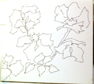
I was going through my stash of paintings getting ready to make my submissions to the upcoming Calyx and FCA art shows, and realized that I had neglected to post this one. It is one of the demos that I did at the collage workshop I taught for the Calgary Sketch Club a few weeks ago. It began with a drawing in Sharpie marker on gator board, of a scene from one of my sketchbooks. I love working that way as I am really free to interpret it.

After painting small pieces of different kinds of papers into a collage palette before me, I began to 'rip and stick' the pieces onto the board without too much disgression. I didn't try to stay inside the lines, as you can see. Some of them will remain visible in the early stages to serve as a guide, but it becomes intuitive after the first layers.

After the board was covered, I then began to paint back into it with acrylics to loosely define the flowers and folliage. The process is sort of like this: rip, stick, paint, rip, stick, paint, etc until it is done.

"Poppy Surprise", mixed media painting, 9x9"
SOLD

Enjoy!

To purchase this, or commission your own painting, please email me.

Monday

Mixed Media Demonstration -cont.

Ok, so after I had gotten to the last step of the mixed media demo from Jan 27th, I spent several hours playing with it, trying to make it work, but it was going from bad to worse! I got frustrated with it and decided to gesso it over and give it another try -kind of a catharsis. I put 2 layers of gesso on it and then a layer of gloss medium to seal the surface. Then I thought I would stamp into the gesso with my large, dry stamp, and behold the gesso was not quite dry so it left a cool imprint in it. You can see above where the stamp actually grazed into the underlying color a bit (the shine is the gloss medium, so you can see where it got removed with my stamp)

So I was re-energized to begin again and see how the new imprints would take the paint. I used the same colours as before (Quin gold, Quin crimson and Ultramarine blue) and popped them in and mixed them around. You can see how the gesso takes the paint differently(it is semi-absorbant) than the gloss medium (non-absorbant); as well, the paint kind of settled into the indentations. I did a little more stamping as well at this stage, mostly with the small spiral stamp.

Next I took a viewfinder design and began to block out some of the shapes with darker paint. At this point I could see the suggestion of where a figure could be (the breast shape on center right side and a butt-cheek and legs in the lower part of the painting. I had no idea where the head would be or what her upper torso was doing. I spent another several hours trying to get her to work -but alas, that wasn't working out either. So desperation hit yet again (heavy sigh) and I took my rubbing alcohol and poured it all over the painting and took my wet sandpaper and scrubbed at the mess until all I had was a ghost of the former paint. This left a very cool texture again, because I had applied the gesso layers with a foam roller, which left a bumpy texture, so the paint lifted off the high bits and remained in the valleys. If you zoom into the painting below, you can see some of that texture.

This time I took and put in some more dark passages, and decided to keep it abstract-no more figure finding for me right now! I painted through a stencil in varying ways to keep the texture moving from the lower right to the upper left -light against dark and then dark against light. Repetition with variation, remember? Then I began to add different colour opaques to it, breaking up shapes and joining others. I was once again having fun!

More dark pattern to link the the elements of the painting together. I think this is the final painting -at least for now!

Moral of this lesson: It's never over 'til it's over -gotta love acrylics...

Enjoy!

To purchase this, or commission your own painting, please email me.

Thursday

Christmas Card w/c demo

This is this year's Christmas card! I did this as a demo for my beginner/experienced beginner watercolour student as a paint along. The lessons covered included negative painting (trees in distant forest), wet on wet reflections (neat that the water feels like it is covered with ice!), masking fluid (foreground deciduous trees), puddling darks (evergreen tree) and bleeding back edges (soft shadows on snow banks). That's a lot to learn!

Wednesday

Workshop Demo Paintings

"Summer Reflections", 5.75 x 8.5", watercolour
This is one of the demos I did at my recent watercolour workshop in Invermere, BC. I was trying to show the class how to make clean and lively darks by knowing how dark you want them to be and then putting them in at that value to begin with using wet and rich pure colour. The demo started with the light bank -it is also important when placing lights onto white paper that you make them lighter than you think they should be, so they will pop when the darks go in. It is tricky to judge their value on the white paper.

"Sandra's Poppies", 10 X 14", watercolour
Another example of putting in the colour in the intensity that you want it to be and having that all important first wash to be lively and fresh. The second washes are only to define things inside the flowers a bit and to pop out some of the leaves, while leaving as much of the original washes untouched. This requires judging each stroke as it goes down to see if it is the correct value, shape and intensity, and determining if it should have a soft, broken or hard edge. The importance of S.E.C.'s again (shape, edge and colour).
Enjoy!

Friday

End of wet-on-wet demo

I continued to work on making the frames more obvious, while at the same time linking the outside with the inside. I still don't think it is working -time to put on my 'what would happen if' hat...
I glazed a mixture of Quin Rose and Ultramarine blue over the outside frame, which definitely helped to separate the 2 frames, but I think the stripe connecting the 2 frames isn't working, so...

it gets a glaze also. This is working better, but it still doesn't have the look I was hoping for. This is a difficult format to work with when you aren't doing a landscape as it is so long and narrow (11" x 30"). It does work better when cropped into two individual paintings though. I think each one still needs something -perhaps I will go back into them with some pastels or pencil crayons, or collage -or just rip them up for future collage purposes???? Nothing is lost as each painting exercise, whether or not the final product is good, is a good learning experience.


So here they are as individual paintings; what do you think?


Enjoy!

Tuesday

new wet-on-wet demo

This is an idea that I got from Karlyn Holman in her excellent books on stretching the possibilities of watercolours with play. This is a half sheet of watercolour paper, cut on the long side (11 x 30") which I wet on both sides, and then began to drop wonderful pure colours into. When I was finished with that fun, I placed pieces of wax paper cut out to look like rock shapes, pieces of oriental lace and unryu papers, cheesecloth stretched out to make interesting patterns, sprinkled a bit of table salt into some of the uncovered areas, and then some scrunched saran wrap on top of all that, and left it to dry in the sun. (no peeking or you will upset the mark making!)
This is a close-up of the left hand side of the sheet so you can see it a bit better. You have to make sure you get your colours dark enough as the sheet is very wet and will dry a lot lighter. (You can click on each of these photos to see them enlarged)
This is what the sheet looked like after it dried and all the stuff was pulled off.
Here is a close-up of the left side of the painting so you can see the subtle textures better. Karlyn glues the oriental papers onto the paper, but I removed mine so I could keep it as pure watercolour. In my class tonight and tomorrow I will work on this by painting both negatively and positively to bring out the rock shapes from the texture. I can't wait as it is so much fun to work this way. Will post in progress pictures on Thursday.
Enjoy!

Friday

more class demo's

"Along the River", watercolour, 5 x 7"
This is the mini demo from Wednesday mornings class. I played with an effect that just happened in the painting -the feeling of light streaming in from the upper right across the distant tree bank. I did this by dampening the 'rays' a bit and gently lifting them with a thirsty brush and kleenex.
Enjoy!

Saturday

Banded Peak Revisited -plein air oil painting

"Banded Peak Revisited", plein air oil painting, 12 x 9"
I took the on site painting back to the studio to complete due to the wind and used my photo reference to finish it. I had wanted to capture the different colour of Banded Peak compared to its neighboring mountains -not sure why it was like that, but it was. I repainted where it had gotten muddy and added a clear value pattern to the mountains, thereby freezing the light, as well as adding a tiny bit of detail. I am quite happy with the way it turned out in the end.
Enjoy!