Monday

More Collage Workshop photos

 Here are some step by step photos I took of two 12" x 12" collages that I did as demonstrations for my collage class. After we completed our b&w collages, we spent a day and a half dying and decorating tissue papers to use in our collages. I chose a complementary palette of blue and orange, and decided to make 2 'T' design collages. Above is the first step of the process (click the images to enlarge them).
Here they are a little further along.The edges of the 'T' have been finessed to make the 3 negative shapes more interesting. 

This is how they looked at the end of the day. I am not sure if they are finished yet, but they are close. I will reassess them in the morning. The painting at left has a 'leaf' motif and the theme of the one on the right is geometric squares. The collages have been painted back into to pull out patterns and line, as well as to establish a colour dominance (orange on the left, blue on the right). Collage is a wonderful way to teach yourself design, and also to experiment with 'what would happen if...'

Here are three of my students busy at work (I chose three with the tidiest tables -you should see mine. It took me 2 days to find my scissors!)

Enjoy!

Share |

Sunday

Wonderful Oooze!

 "Cle Elum Autumn", watercolour and chalk pastel, 11 x 15"
NFS

This fall I was fortunate enough to be able to take a workshop from Catherine Gill and Bob Phiney just outside Seattle. We spent 2 days painting in watercolour en plein air, and on the last day, we got to play with chalk pastels with the watercolours, which is the sole reason I took the workshop! I found Cathe via her new book "Powerful Watercolor Landscapes" and her free workshop through the Artist's Magazine. You can watch her excellent presentation here.  EVERYONE should watch this webinar as it is a wonderfully presented talk on all things compostitional -and this applies not just to watercolours! In Cathe's book, there are many beautiful paintings that combine pastel with the wet watercolour, and they feel so neat that I just had to learn how she does it. The trick is to paint into the sopping wet watercolour with the chalk pastel, keeping the values the same but changing the colour, and the pastel just melts into the wash. You build the surface up in layers, because as soon as the paper dries, you have to wet it again in order to make the pastel work properly. This adds the dimension of opacity and PLAY to an otherwise transparent and somewhat fussy medium.
        I just got an email from Cathe saying she is doing an Ooze demo at the Seattle CoArts monthly meeting in Shoreline area of Seattle. If you live anywhere near there, I highly recommend taking it in.


Enjoy!
Share |

Wednesday

Collage Workshop -Day 1

Today was the first day teaching my new collage workshop. We only have 7 students, so there is lots of room for everyone to spread out and make a mess, which we are certainly doing!  The exercise to begin the workshop consisted of painting three 8x11 sheets of photocopy paper, one sheet with mid-value grey, one with white gesso and the last one with black gesso. Then we the made nine 3.5 x 3.5" squares in our sketchbooks -three of them were painted black, three the mid-grey, and left 3 white. After a discussion of some compositional formats, the students plowed ahead to make their collages, using torn and cut pieces of the painted papers. One of my students commented "This is HARD, you really have to think!", and she was right. I had them focusing on value dominance and repetition with variation in the shapes and lines. There is a lot to learn here, and the learning happens best when you actually put the time in and make these sample collages. Hopefully they will be ready to put colour and pattern to work in a couple of days, once they really get the idea of designing with just 3 values. These collages need to be interesting enough so that they will work on a much larger square.
 
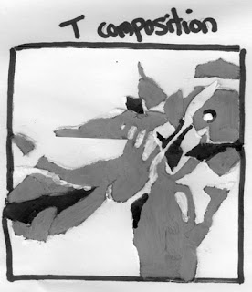
My first composition is a T composition on a white square. Things to remember in this composition are:
       -1 positive shape which touches 3 sides 
       -makes 3 negative shapes, each needs to occupy a different volume
       -positive shapes should interlock with the negative shapes to make interesting shapes
       -design the location of the focal point (a logical place is where the arms of the T meet)
       -the focal point will have the most detail, the smallest shapes and the highest contrast
       -must design the movement around the T as well as the focal area, being careful not to lead the viewers eye right out of the composition
 
The 'bridge' composition came next, it was done on a grey square. Points to remember:
       -1 positive shape which meets two sides
       -2 negative shapes which should be different in volume from each other and from the positive shape
       -positive shapes should interlock with the negative shapes      
       -design the location of the focal point -off centre along the bridge shape in one of the 'sweet' spots of the rule of thirds
        -the focal point will have the most detail, the smallest shapes and the highest contrast
        -the use of line can be used to create movement within the positive shape
        -the two negative shapes do not need to be the same value

 Lastly I did a cruciform composition on a black square. I combined the cruciform with a radial design for this one. Things to remember include:
          -1 positive shape which can be interupted by other values
          -4 negative shapes, all of which should occupy different volumes
          -positive shapes should interlock with the negative shapes     
          -design the location of the focal point (a logical place is where the arms of the X meet)
          -the focal point will have the most detail, the smallest shapes and the highest contrast
          -the use of line can be used to create movement within the positive shape
          -the use of the circle in my focal point is repeated in different sizes and values elsewhere to lead the viewers eye around the painting
          -in all of the designs make sure that when an arm hits the outside edge, that it breaks up the format's edge in uneven intervals

A lot to think about eh? Give this exercise a try to teach yourself about design. Stay tuned for tomorrow's lessons.

Enjoy!

Share |

Tuesday

More Fall Plein Air Paintings


 "October Marsh", 9 x 12", plein air oil
$595.00 -free shipping and handling

Another of the last paintings of the fall -I was mourning the loss of fall as I shoveled my driveway this morning! There is something about this painting that I just love, but I can't quite put my finger on it -I think it is the colour harmonies are just so darn pleasing. I will have to use this palette more to explore its possibilities.

This is the billboard that is found on 9th Ave SE announcing my show.
 
And here I am in front of some of my show paintings. Hope you can stop by if you didn't make it to the opening. You will be able to see all the paintings in the show by the end of the week (hopefully) at Arts On Atlantic's website.
 
Enjoy!

To purchase this painting, or commission your own painting, please email me.

Share |

Monday

Fall Plein Air Paintings

 "Fall Pathway -Fish Creek", 12 x 16" plein air oil
SOLD

I have the last of the fall's plein air paintings to post, so this is the first. I think I was in a 'million brush strokes/texture' mood this day, or perhaps I was affected by the dappled light in this meadow. This is one of the paintings in my new show, which opened yesterday. Too bad we forgot that it was a long weekend when we planned the opening! Oh well, next time : )

Enjoy!

To purchase this painting, or commission your own painting, please email me.
 Share |

Thursday

New Solo Show opens Sunday!

 My new solo show "En Plein Air -Expanding Horizons" opens this Sunday from 2 to 5pm at Arts on Atlantic Gallery in Inglewood. I will have plein air paintings from my many travels this year as well as from my regular painting grounds. I hope that you will be able to stop by on Sunday, but if not, the show is up until Dec 10th.
See you there!
Share |

Tuesday

UPCOMING COLLAGE IMPRESSIONS WORKSHOP

"Fall Abstract", mixed media, 9 x 9", SOLD
I am teaching a new 5 day workshop called Collage Impressions beginning on November 16th and running from Wednesday to Friday, weekend off, then Monday & Tuesday -each day from 10am to 3:30pm. The class is for experienced beginners through advanced painters. This class will focus on collage in combination with acrylics, and we will be making a lot of our own collage papers as well as using purchased and found papers. We will try on different modes of expression within this huge field, working both abstractly and representationly. To register, go here. The cost of the course is a very low $315. Hope to see you there!!!
Sharon
PS Please pass this on to anyone who may be interested!

Share |

Monday

Still More Watercolour Florals

 "Lily Fantasy", 6.5 x 10.25", matted watercolour
available for auction here, beginning price $50

This is another free form flower form, done with out much preliminary drawing, just basically where the stamens reach above the petal edge at the top and a bit of a sweep for the direction of the petals. The demonstration point for this one was to show how to produce lost and found edges on dry paper, allowing the flower to co-mingle with the background.

"Falling All Over", 10 x 14", matted watercolour
available for auction here, beginning price $100

This was the next demonstration that I did, and NO preliminary drawing was done on this at all. I began at the large yellow flower and just made my way out from there. Composition was not the prime concern here, although I think it turned out quite nicely. I had a large bouquet of mixed silk flowers in front of me and I just allowed myself to be inspired by the shapes and colours, so not at all true to the set-up. Great freedom and fun.

Enjoy!

Share |

Tuesday

More Watercolour Florals

 "Iris Power", 6 3/4 x 10 1/4", watercolour
available by auction here, starting bid $50

 Don't ask me why I cannot come up with more original titles for these paintings, any help would be appreciated! This is my watercolour demonstration from day 3 of my workshop. The idea was to combine methods from the previous 2 days into this painting. We worked on composition, trying to find good shapes, both the positive shapes (leaves and flowers) and the negative shapes (the shapes behind the positive shapes). Both must be interesting (ie: interesting edges, varying sizes) and compelling (powerful shapes) if you want to have a great painting.
We began this with doing our drawings on tracing paper, which made them easy to change without damaging the watercolour papers' surface. When the designs were good, we traced them onto our watercolour paper. Two ways to do this are#1) to place saral transfer paper under the tracing paper with its black side down on the wc paper (or make your own transfer paper by covering the back of another piece of paper with graphite) and then put the tracing on top and go over all the lines with a ball point pen or #2) hold the tracing paper design against a bright window and then put the wc paper on top -you should be able to see through 140lb wc paper well enough to see the lines, especially if you go over the tracing paper lines with marker. I used watercolour pencils to trace my drawing on the window, varying the colours as I went along (remember interest??)
Here is the painting part way in. I was careful to loose some of the edges into the white background space, bleeding them back with clear water so no hard edges were left. The colour was puddled in, at the correct values, thereby keeping things fresh and eliminating the need to wash over them again = the key to clear, clean colour! I have gone back with another watercolour pencil to define the centre left edge of the upper flower. Most of the watercolour pencil melts into the washes, so isn't a problem the way that graphite can be. This stage makes sure that you have some hard and soft edges.
In this step I have added more leaves at the bottom, and threaded one large leaf up the bare right side. I did this without drawing it first. I loaded up my brush with non-homogenized colours and let the brush make the form by twisting and turning it while drawing it up my paper. I did some scraping into it with a credit card, and drew into it while it was wet with a watercolour pencil.I dropped other colours into the bottom to suggest other flowers behind and relieve some of the green. I have gone in and separated some of the iris petals and to add some texture. Note that most of the original washes remain untouched. I also placed a bit more colour into the background at the top of the top iris to show more of its form.

There you have it! Some things done with a limited wet-on-wet method, and some negative painting. Both combine to provide interest, while the exciting purity of colour puddling lends the power.

Enjoy!

Share |