Today was the first day teaching my new collage workshop. We only have 7 students, so there is lots of room for everyone to spread out and make a mess, which we are certainly doing! The exercise to begin the workshop consisted of painting three 8x11 sheets of photocopy paper, one sheet with mid-value grey, one with white gesso and the last one with black gesso. Then we the made nine 3.5 x 3.5" squares in our sketchbooks -three of them were painted black, three the mid-grey, and left 3 white. After a discussion of some compositional formats, the students plowed ahead to make their collages, using torn and cut pieces of the painted papers. One of my students commented "This is HARD, you really have to think!", and she was right. I had them focusing on value dominance and repetition with variation in the shapes and lines. There is a lot to learn here, and the learning happens best when you actually put the time in and make these sample collages. Hopefully they will be ready to put colour and pattern to work in a couple of days, once they really get the idea of designing with just 3 values. These collages need to be interesting enough so that they will work on a much larger square.
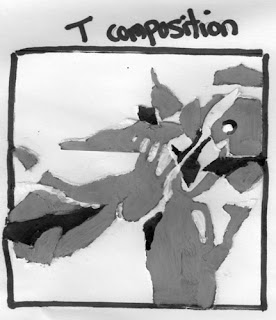
My first composition is a T composition on a white square. Things to remember in this composition are:
-1 positive shape which touches 3 sides
-makes 3 negative shapes, each needs to occupy a different volume
-positive shapes should interlock with the negative shapes to make interesting shapes
-design the location of the focal point (a logical place is where the arms of the T meet)
-the focal point will have the most detail, the smallest shapes and the highest contrast
-must design the movement around the T as well as the focal area, being careful not to lead the viewers eye right out of the composition
The 'bridge' composition came next, it was done on a grey square. Points to remember:
-1 positive shape which meets two sides
-2 negative shapes which should be different in volume from each other and from the positive shape
-positive shapes should interlock with the negative shapes
-design the location of the focal point -off centre along the bridge shape in one of the 'sweet' spots of the rule of thirds
-the focal point will have the most detail, the smallest shapes and the highest contrast
-the use of line can be used to create movement within the positive shape
-the two negative shapes do not need to be the same value
Lastly I did a cruciform composition on a black square. I combined the cruciform with a radial design for this one. Things to remember include:
-1 positive shape which can be interupted by other values
-4 negative shapes, all of which should occupy different volumes
-positive shapes should interlock with the negative shapes
-the use of the circle in my focal point is repeated in different sizes and values elsewhere to lead the viewers eye around the painting
-in all of the designs make sure that when an arm hits the outside edge, that it breaks up the format's edge in uneven intervals
A lot to think about eh? Give this exercise a try to teach yourself about design. Stay tuned for tomorrow's lessons.
Enjoy!
Share |
-the two negative shapes do not need to be the same value
Lastly I did a cruciform composition on a black square. I combined the cruciform with a radial design for this one. Things to remember include:
-1 positive shape which can be interupted by other values
-4 negative shapes, all of which should occupy different volumes
-positive shapes should interlock with the negative shapes
-design the location of the focal point (a logical place is where the arms of the X meet)
-the focal point will have the most detail, the smallest shapes and the highest contrast
-the use of line can be used to create movement within the positive shape-the use of the circle in my focal point is repeated in different sizes and values elsewhere to lead the viewers eye around the painting
-in all of the designs make sure that when an arm hits the outside edge, that it breaks up the format's edge in uneven intervals
A lot to think about eh? Give this exercise a try to teach yourself about design. Stay tuned for tomorrow's lessons.
Enjoy!
Share |


Thanks for sharing this, Sharon -- almost (but definitely not quite) like being there. :-) Have a great rest of the class!
ReplyDeleteGreat post! I love how well you articulate and illustrate your points. Can't wait to try this!
ReplyDeleteThanks girls! I just love to teach, can you tell?
ReplyDelete